Project Overview
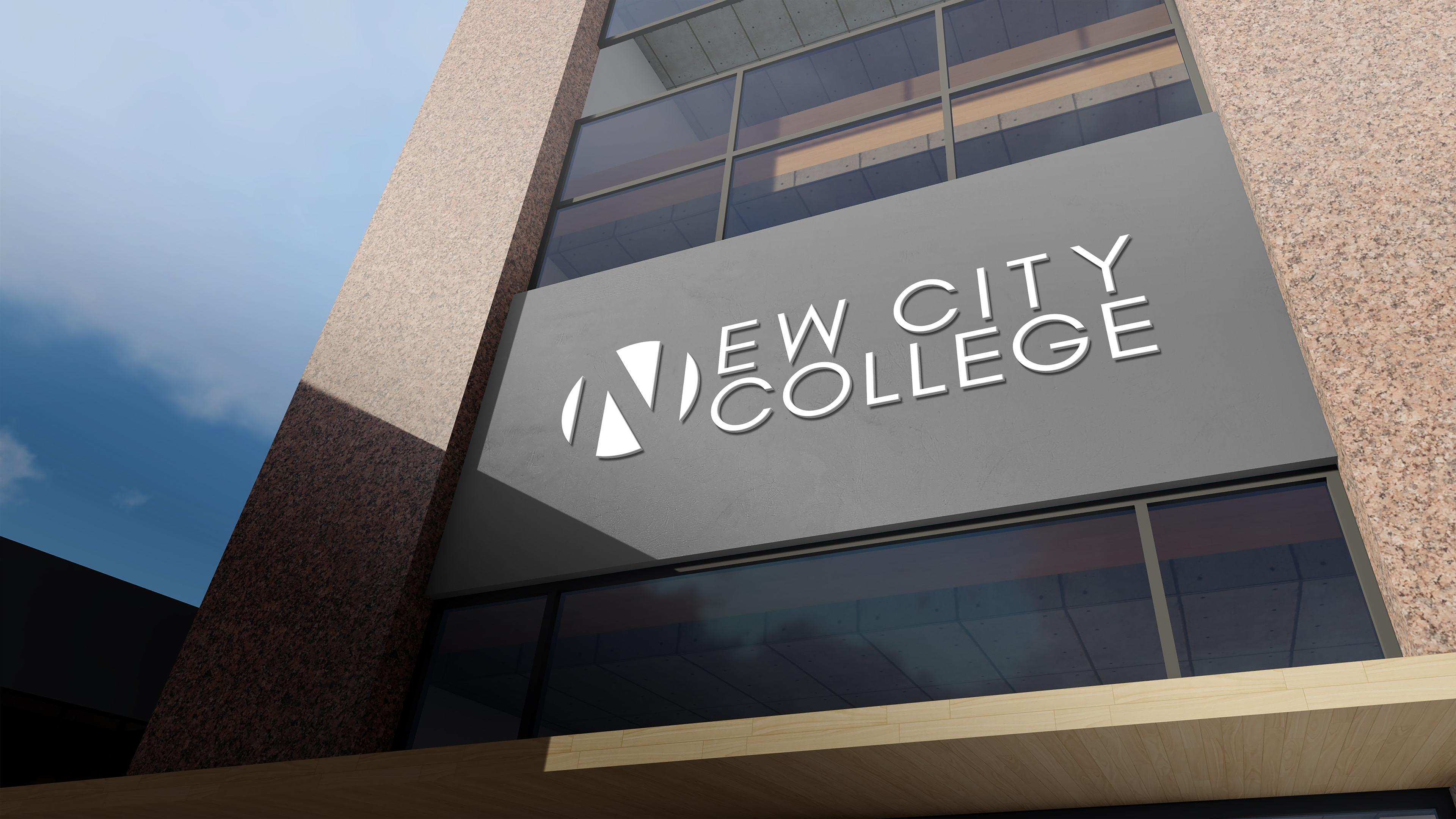
New City College needed a unified visual identity that could work across all five campuses while remaining simple, recognisable, and easy to apply in both digital and physical environments. I developed a refreshed brand system that modernised the college’s look, strengthened consistency, and improved clarity across signage, print, and online materials. I was given this project as a student designer and was my first real design project back in college.
Colour Pallet
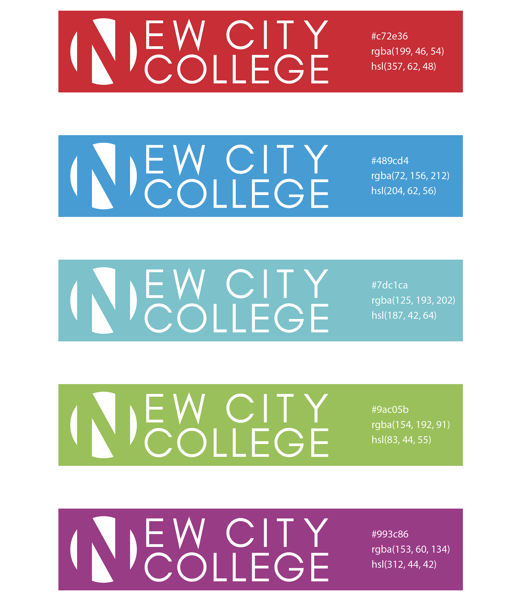
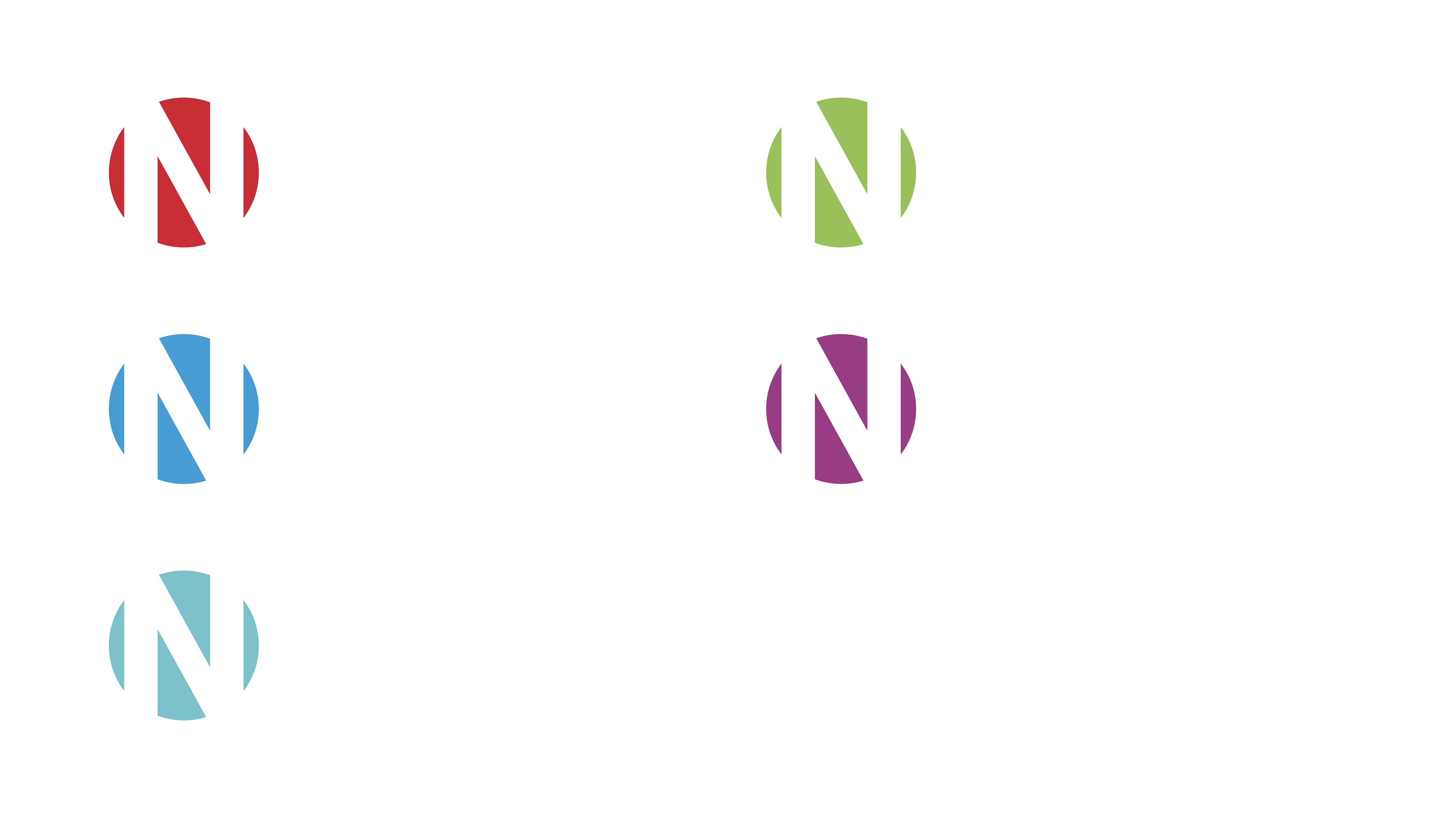
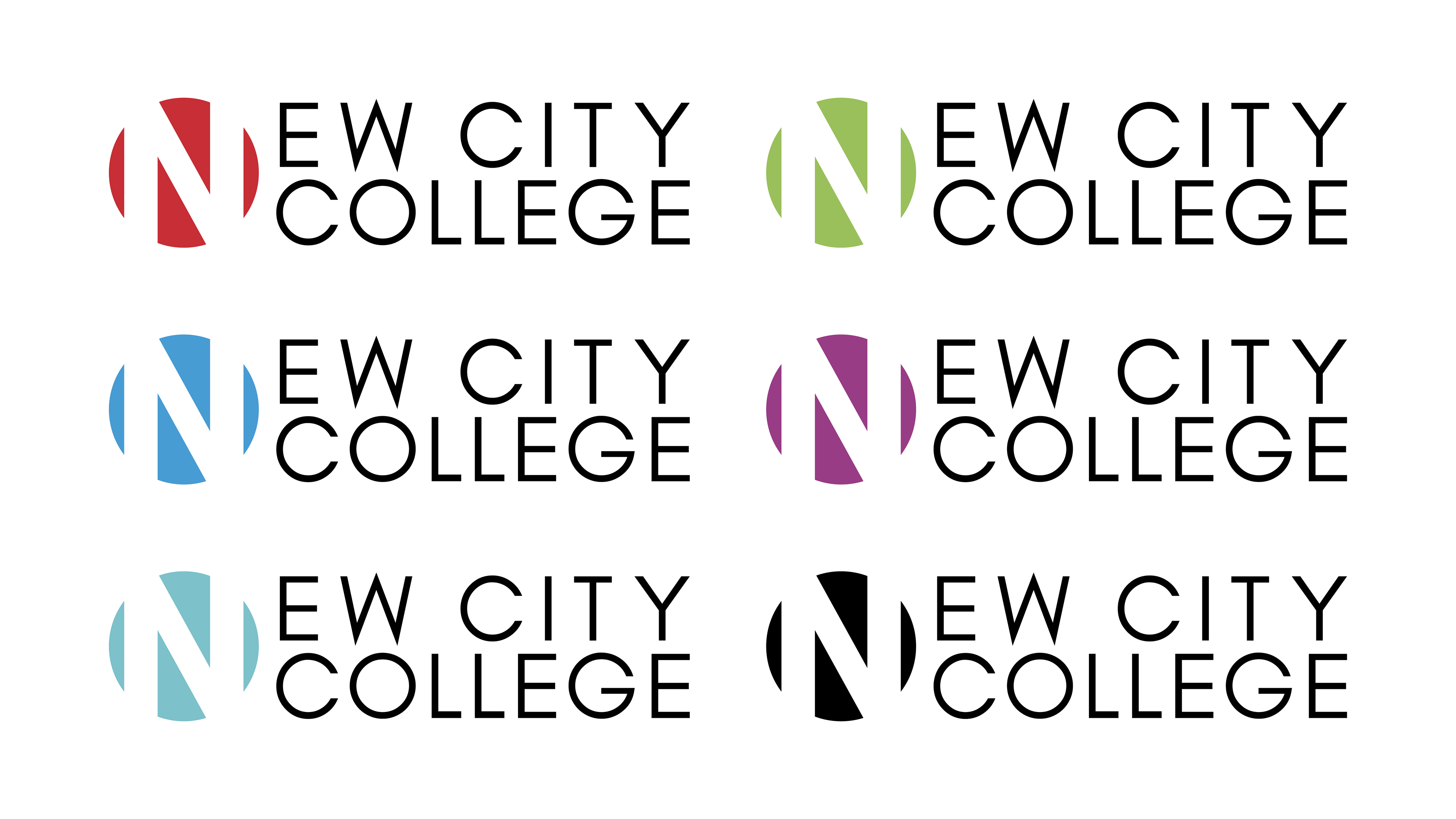
The colour pallet was designed to differentiate each campus through a clear, intuitive system. By assigning a distinct colour to each location, the brand maintains cohesion while allowing students and staff to identify campus‑specific materials at a glance.
Typography
The typography focuses on clarity and accessibility. A clean typeface supports legibility across posters, signage, and digital screens, while a simple hierarchy ensures information is easy to scan and understand in busy educational environments.
Logo Variations
The identity includes a set of logo variations. These include colour‑coded campus versions as well as a standard all white/black version which stands out as the main logo incorporating all campuses and would be used across all brand media, when relating to a specific campus the colour-coded version would be used.
Before / After or Modernised Comparison
The modernised NCC logo retains the core structure and colour‑coding system from my original design, showing the longevity and adaptability of the concept. While updated for contemporary standards, the foundation of the identity remains recognisably intact. This change was made many years after my original design by a different designer most likely to fit with modern design standards and improve readability of the word "New" in the name.
Project Reflection
This project strengthened my ability to design for large, multi‑site organisations where clarity and consistency are essential. Working across signage, print, and digital applications taught me how to build systems that function in real‑world environments, not just in controlled layouts. I also deepened my understanding of accessibility, especially how colour, hierarchy, and spatial structure support diverse audiences across a college network.
Along the way, I refined my skills in brand system development, environmental design, and large‑scale asset organisation, using Adobe Illustrator and Photoshop to create clean, scalable visuals.
Skills
- designing for multi‑site consistency
- real‑world environmental application
- accessibility‑driven decision‑making
- brand system development
- Adobe Illustrator + Photoshop workflow