Project Overview
Lens Neuro is a brand built to amplify and support the neurodivergent community. I was responsible for developing the identity from the ground up, including the logo, brand guidelines, and a set of visual flash cards designed to help the client communicate their mission during meetings and workshops. The goal was to create a brand that felt empowering, accessible, and representative a visual anchor that gives this community their voice back.
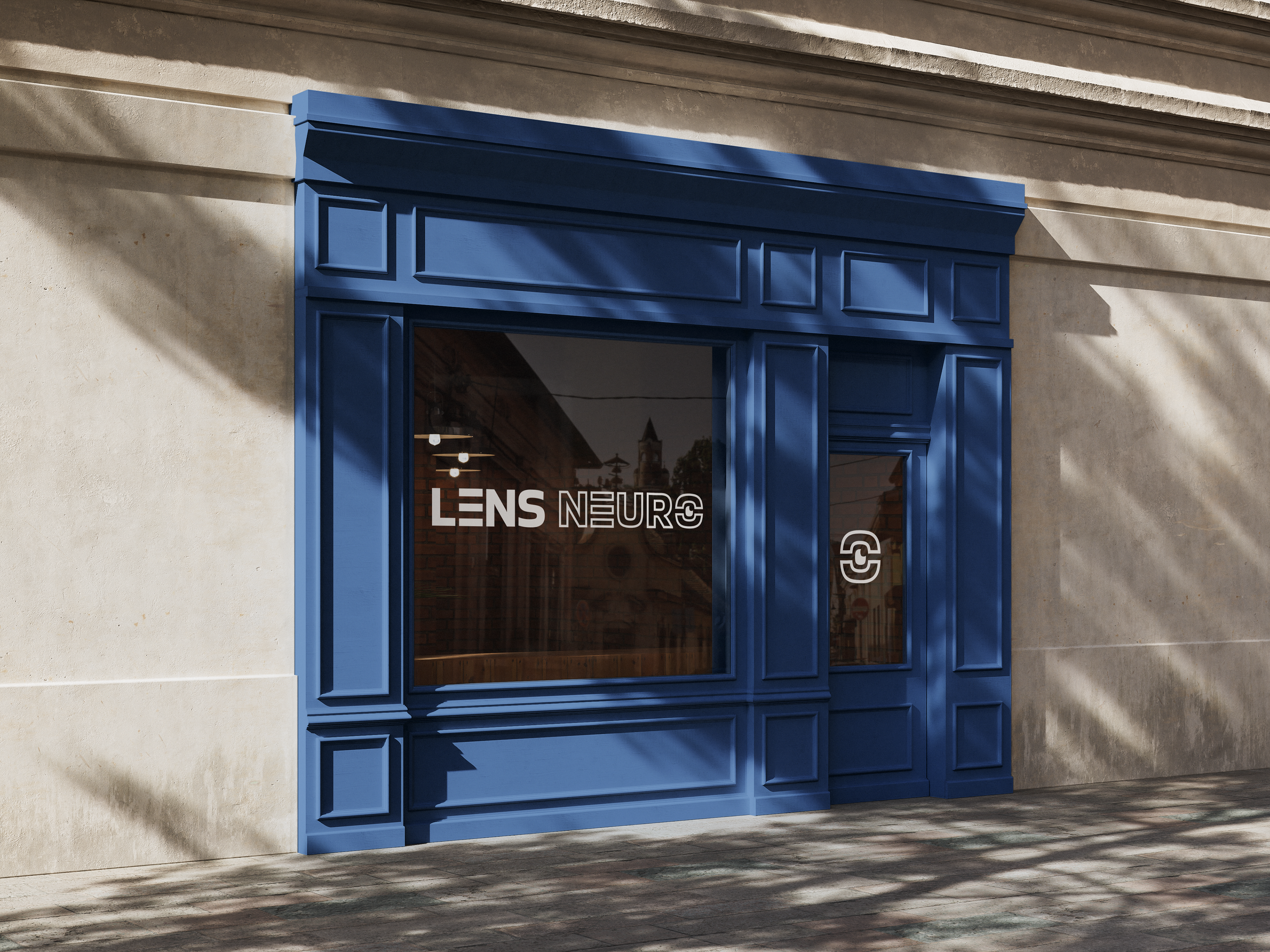
Logo
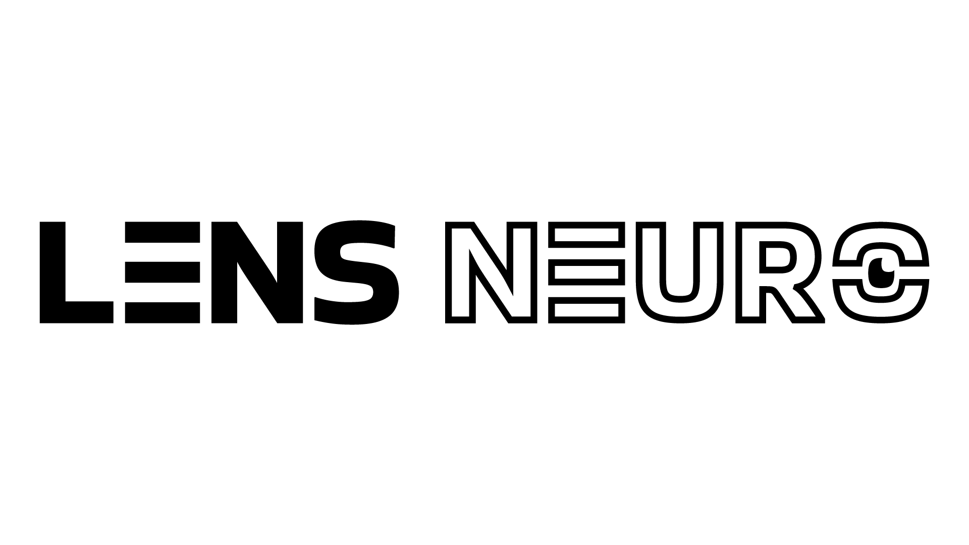
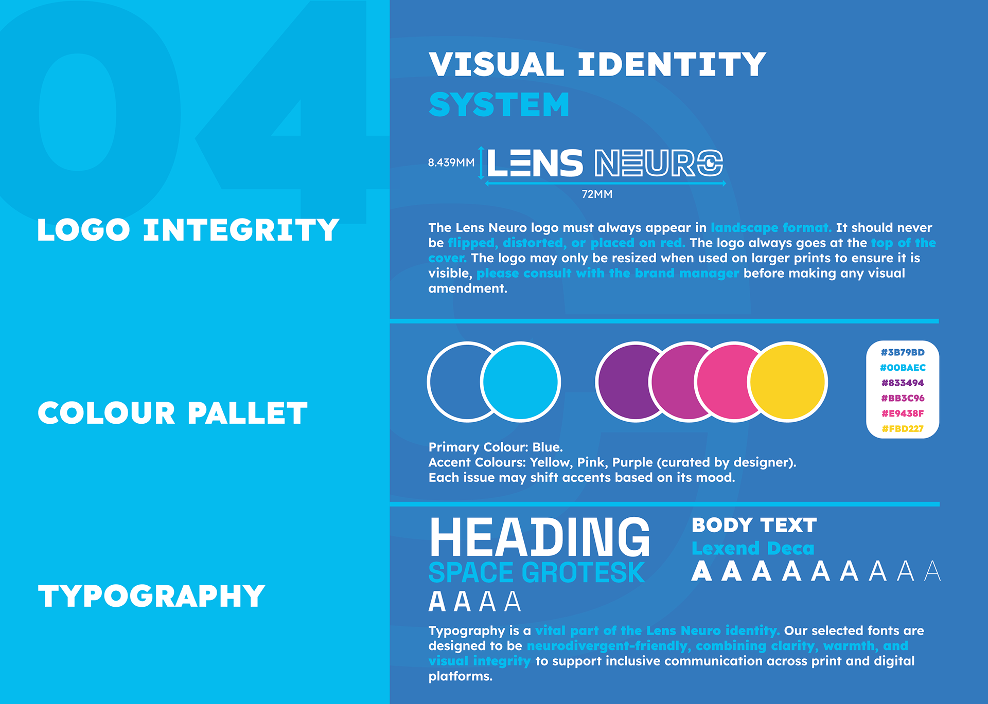
A clean, accessible logo designed to reflect clarity, support, and neurodivergent identity. The lens is used to represent that of the neurodivergent client base of the brand.

Logo Variants
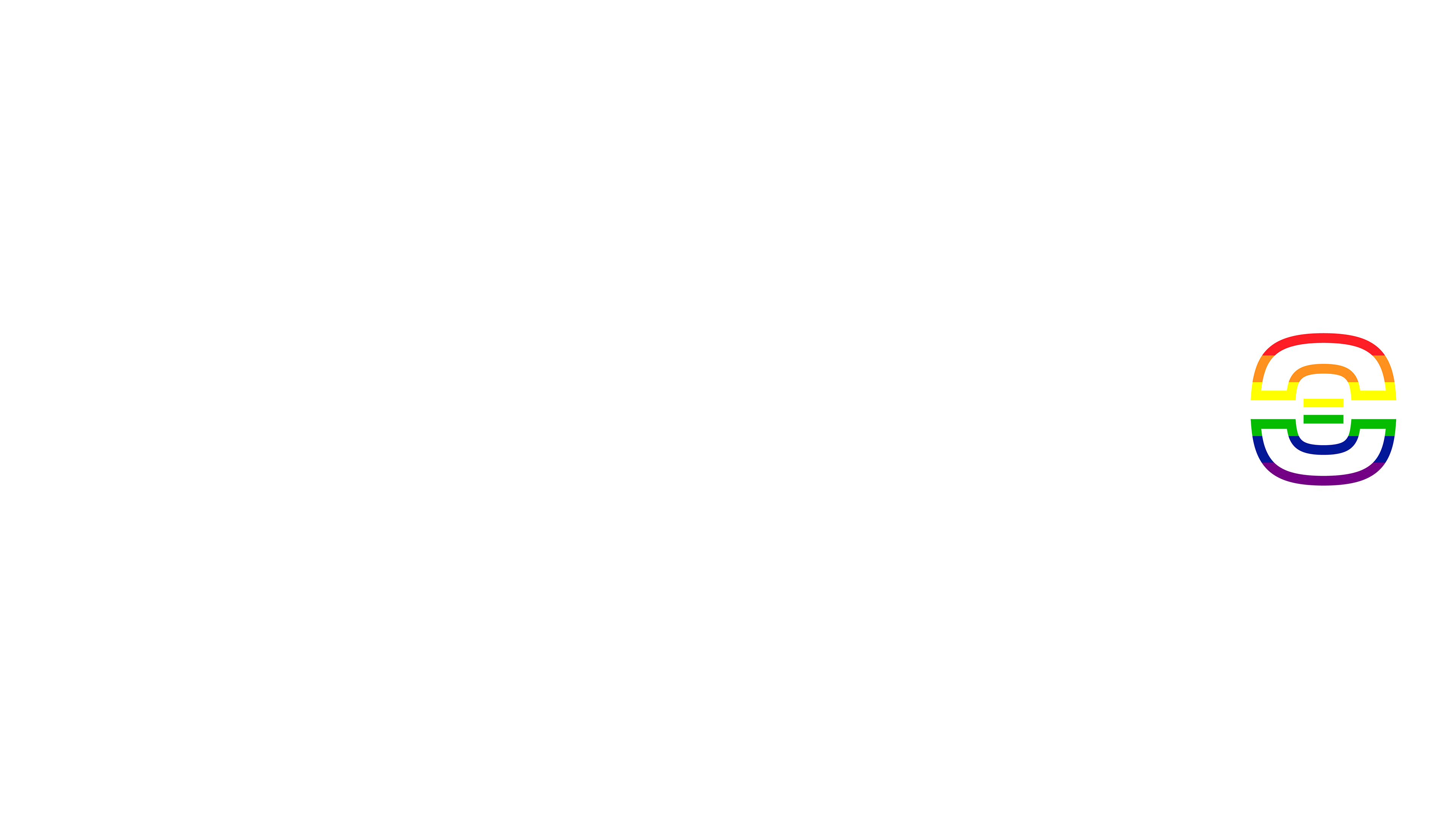
The Lens Neuro identity includes a set of seasonal logo variants designed to support community‑focused events throughout the year. These include versions for Valentine’s Day, Pride, Halloween, and Christmas, alongside the core black and white marks. Each variant maintains the structure of the primary logo while adapting the colour palette to suit the occasion for example the pride logo.

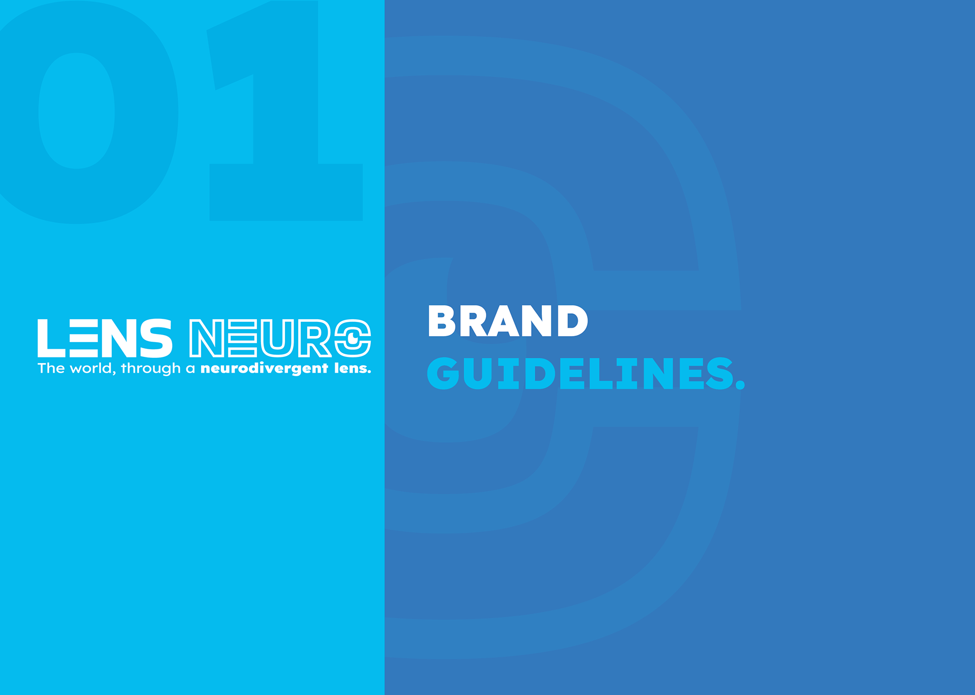
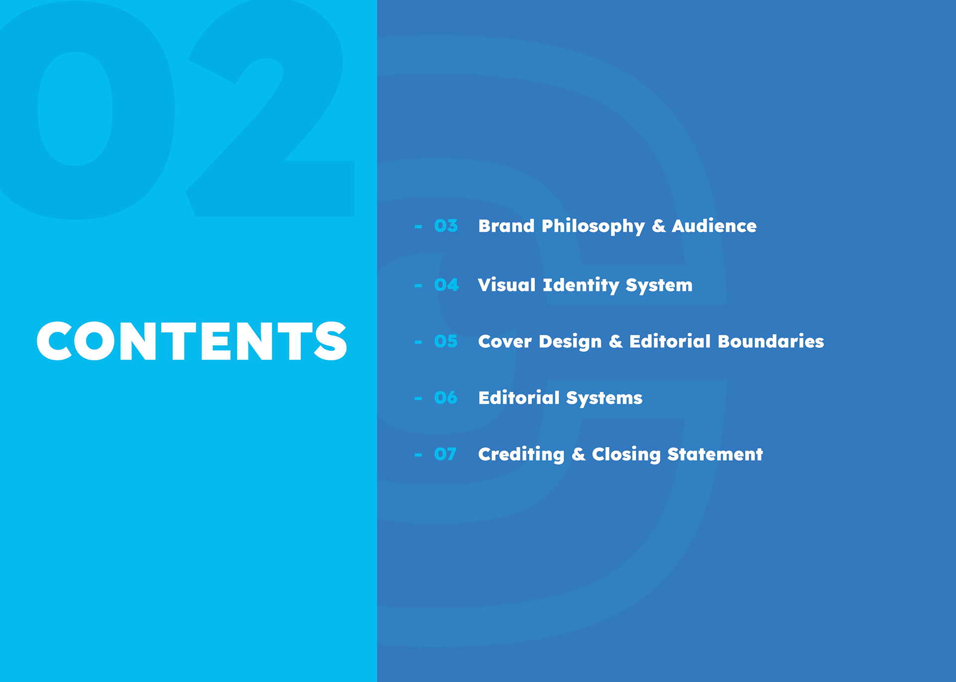
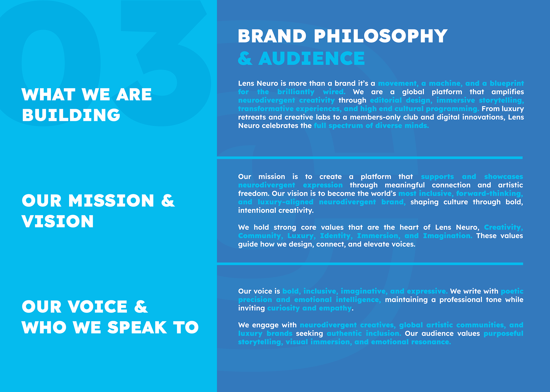
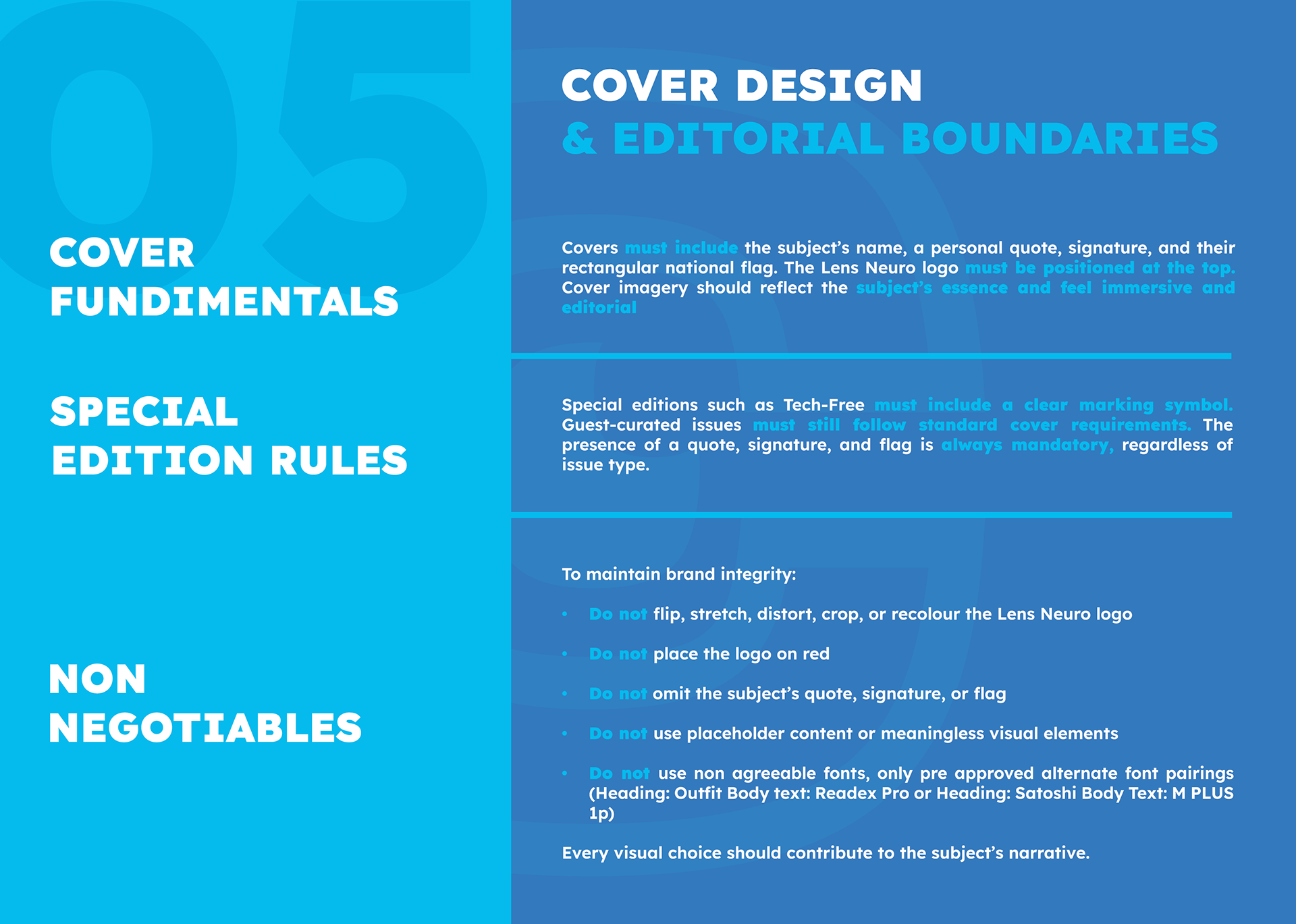
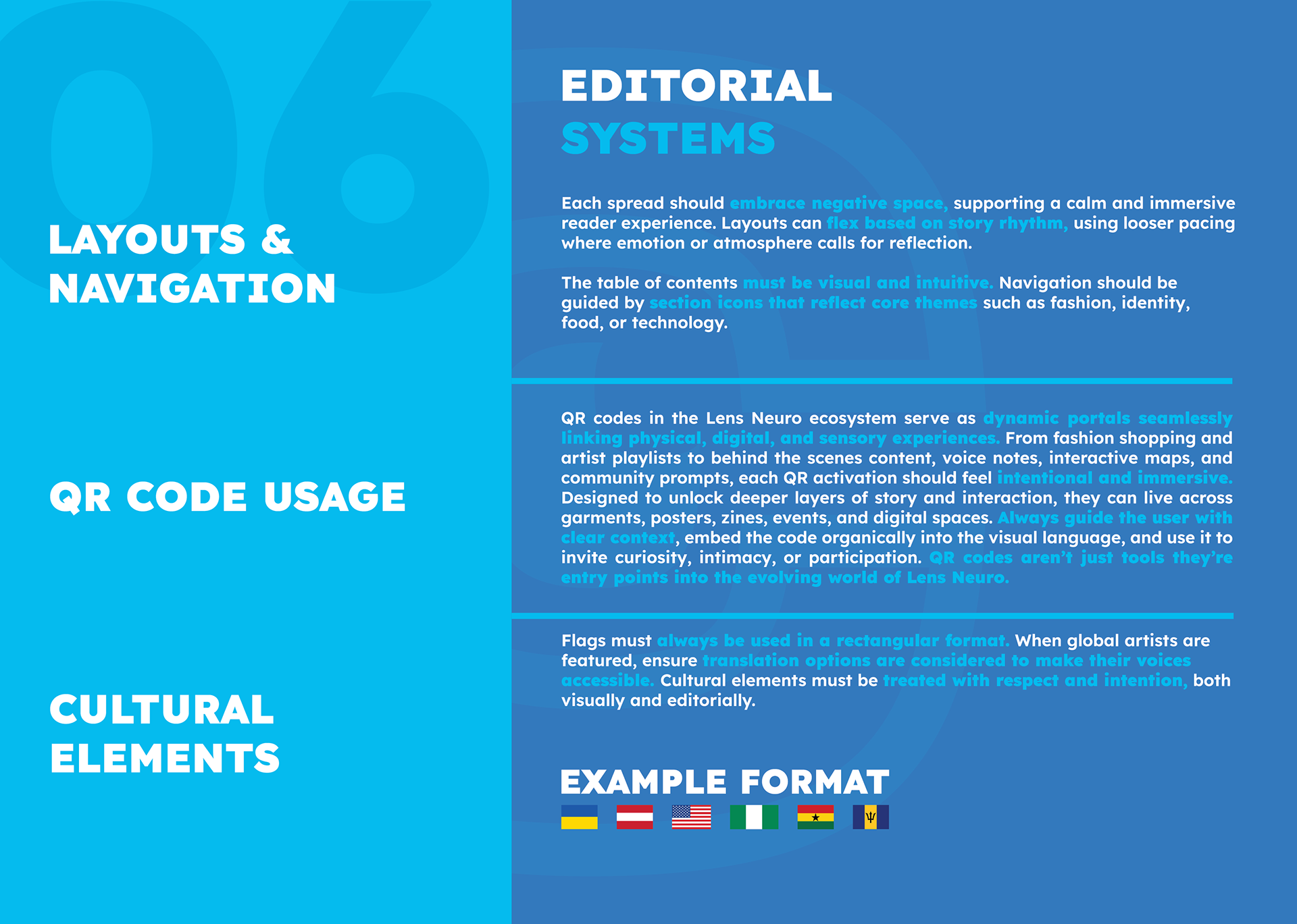
Brand guidelines
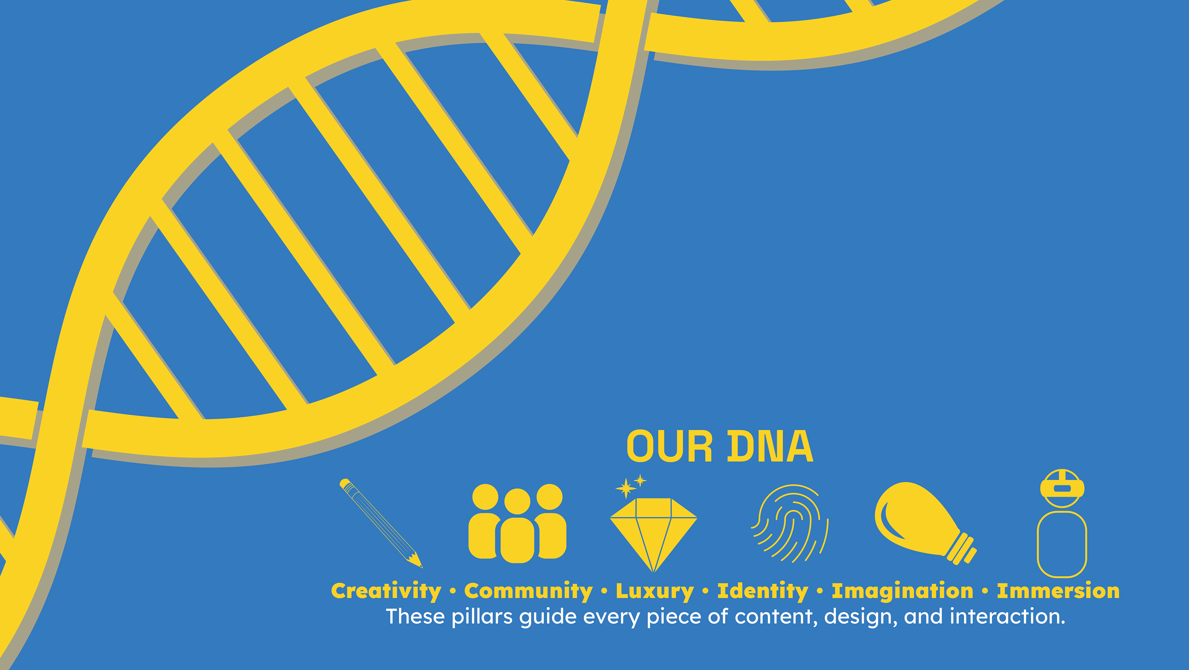
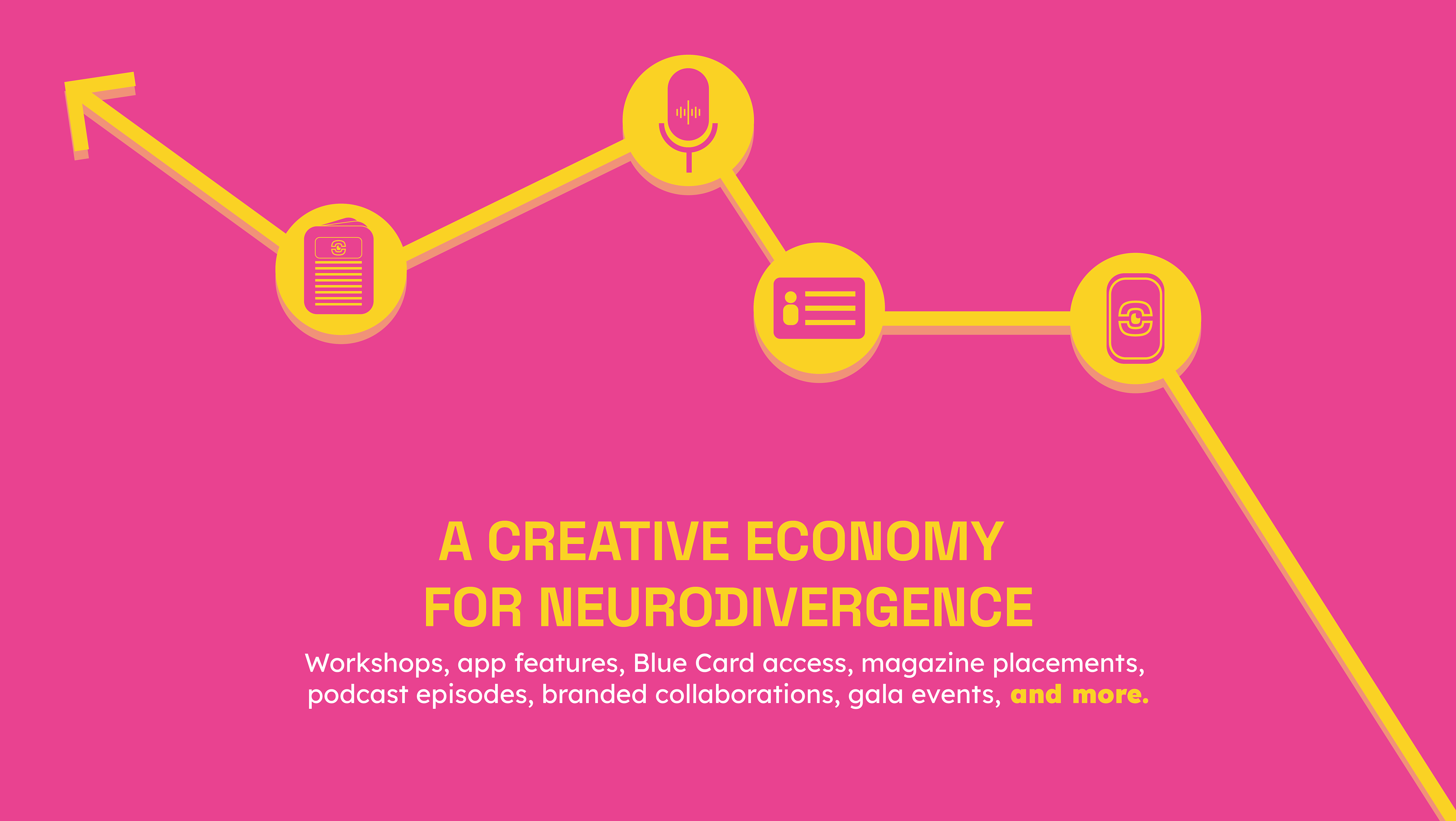
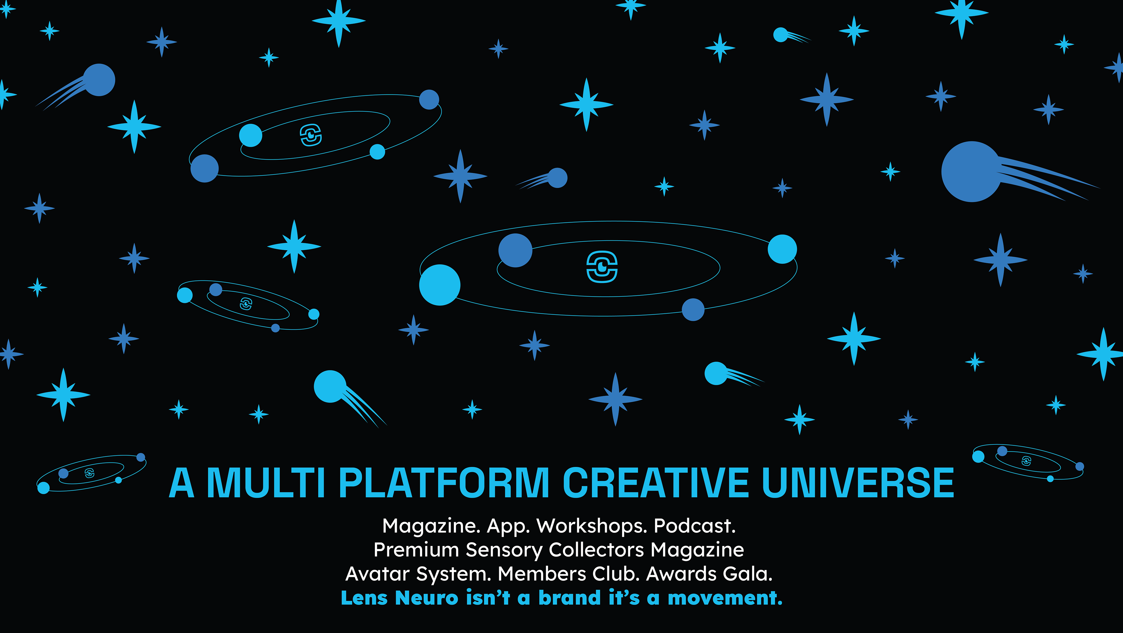
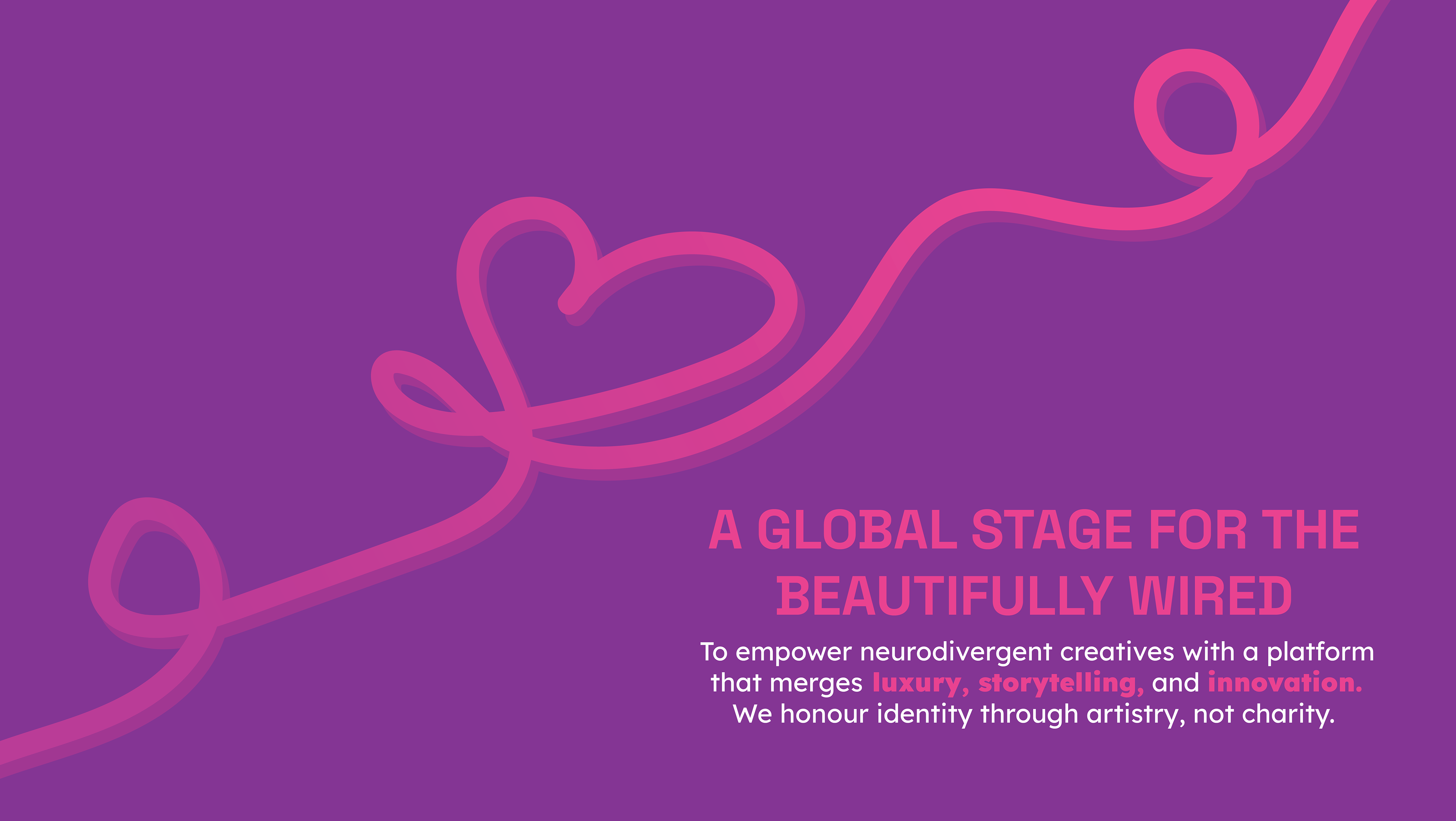
The client supplied the written content, and I was responsible for designing the full visual structure of the Lens Neuro brand guidelines. I worked closely with the client to bring her vision to life and ensure the guidelines were clear, accessible, and aligned with the brand’s purpose.
Pitch Cards
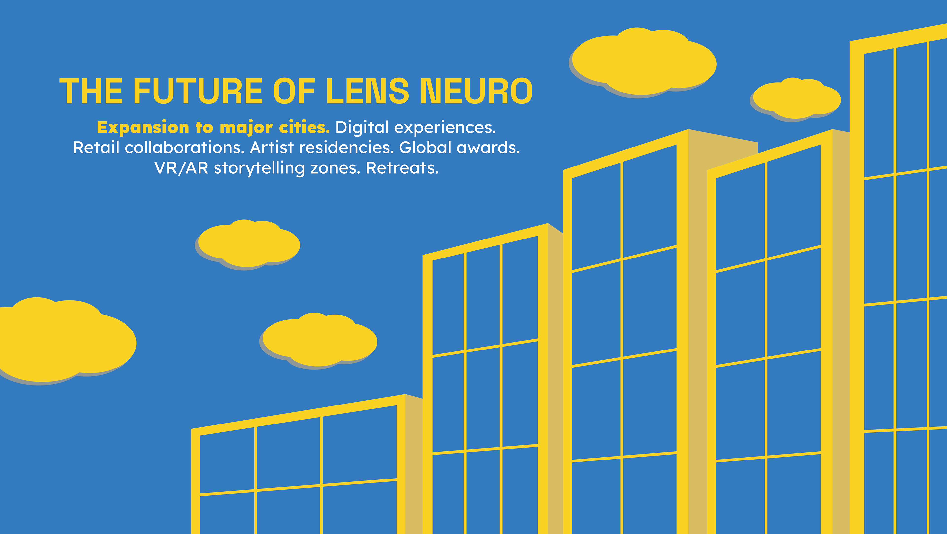
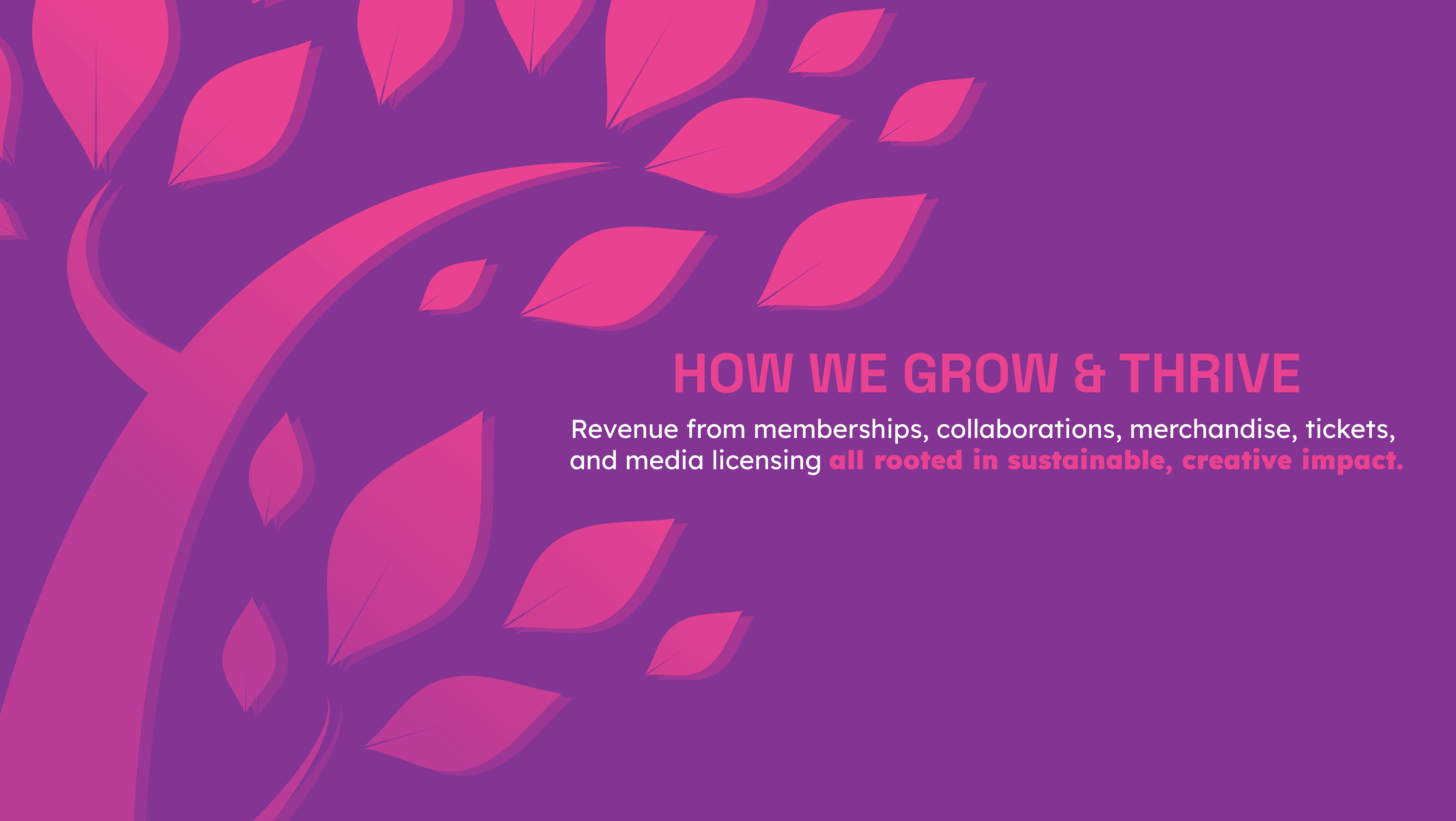
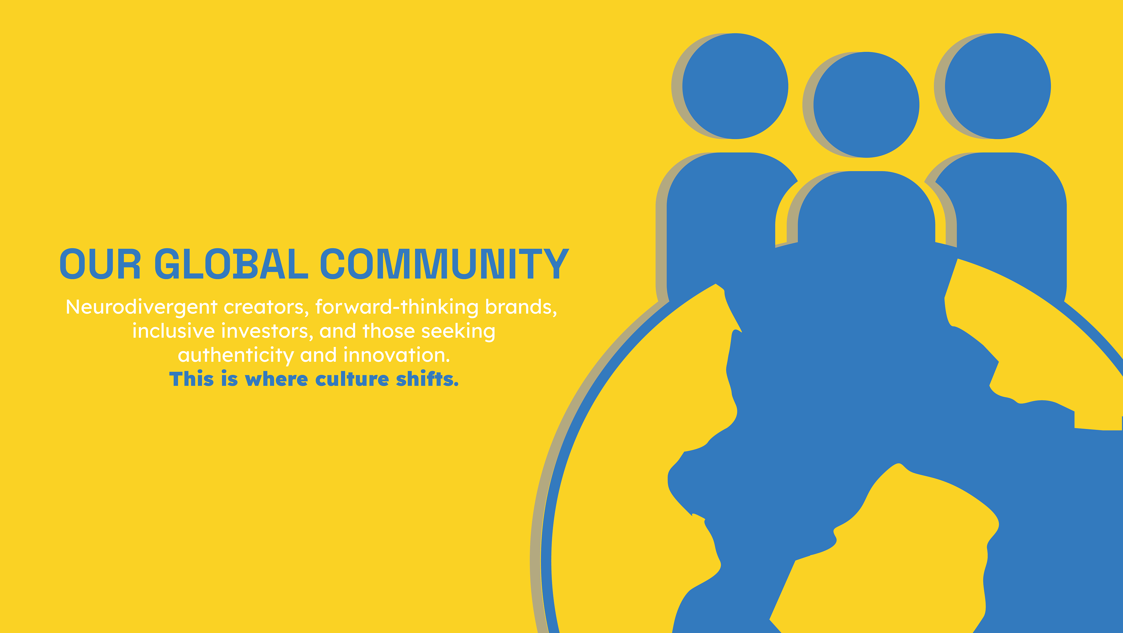
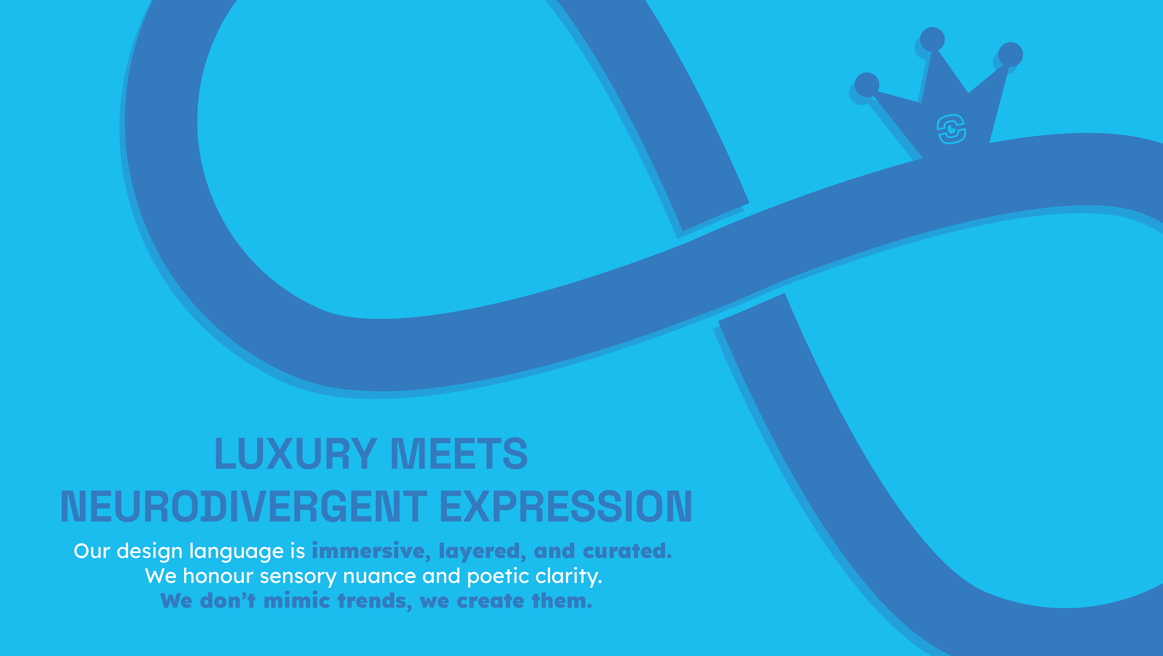
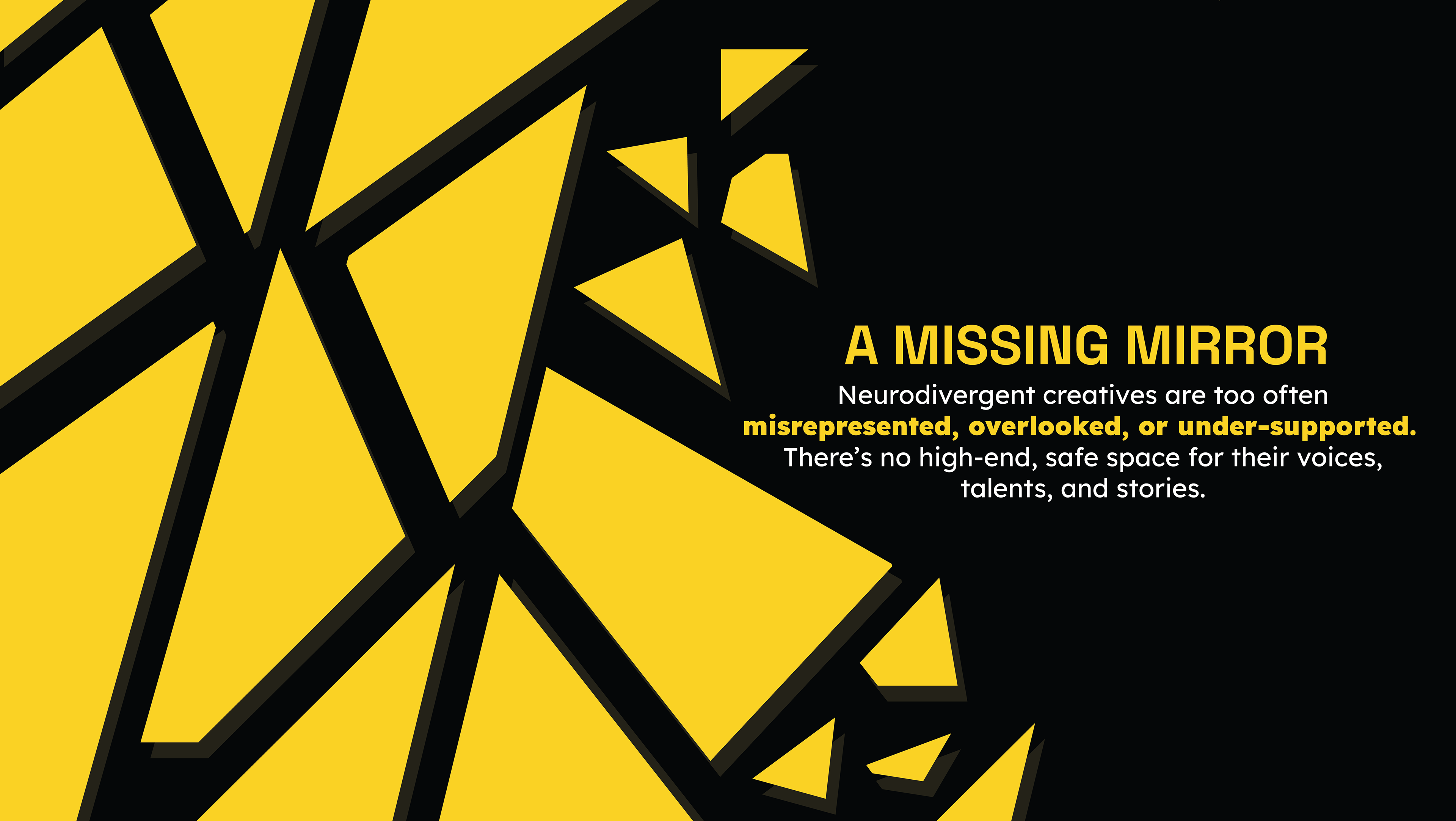
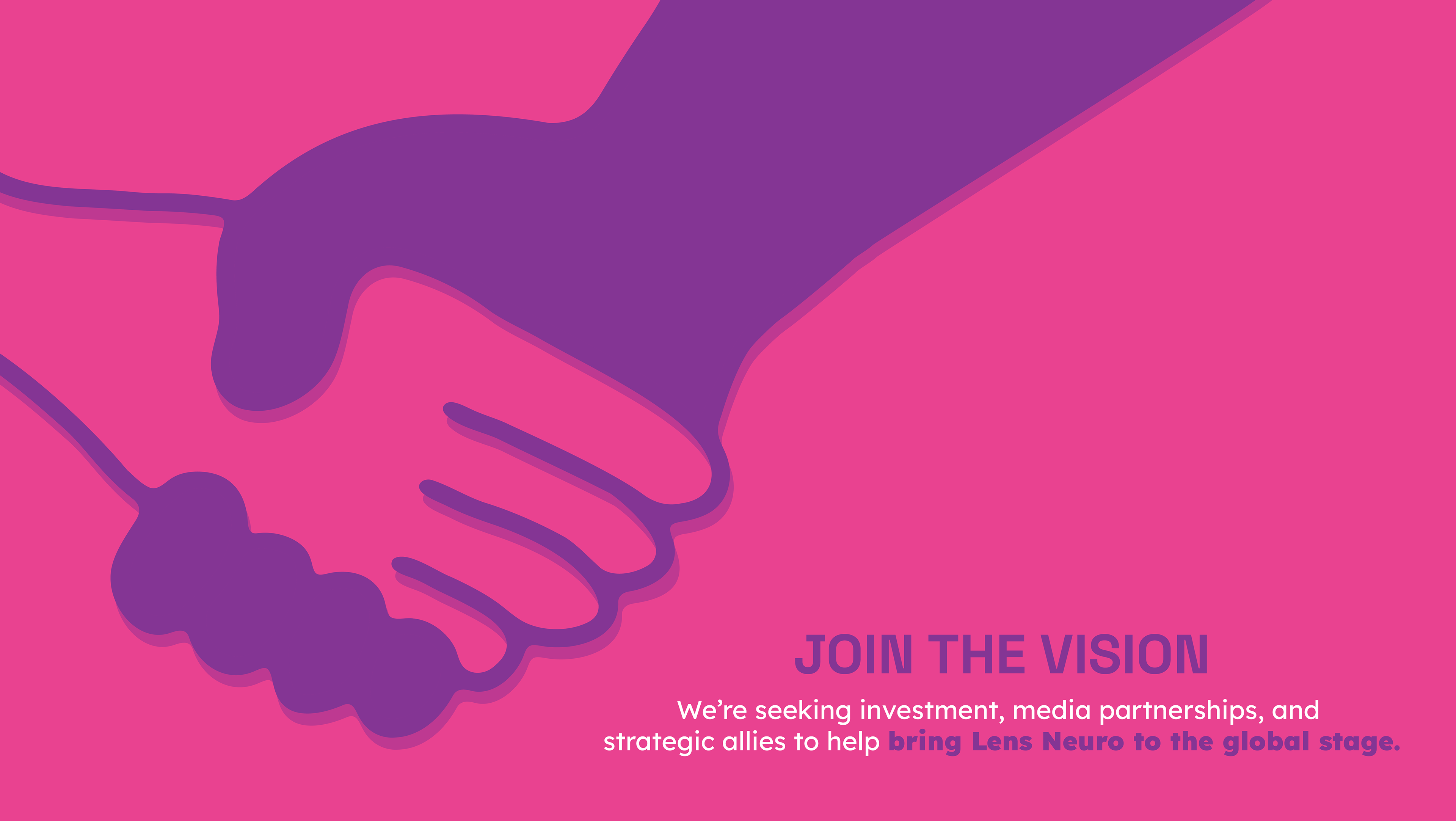
The Lens Neuro Pitch cards were created as a practical communication tool for client meetings, workshops, and community sessions. Each card distils a key concept into a clear, neuro‑friendly visual, helping the client explain ideas without relying on dense text or overwhelming layouts. The cards were designed to be accessible, easy to process, and visually consistent with the wider brand system. All visual elements were hand drawn and recreated digitally.
Project Reflection
Lens Neuro was a meaningful opportunity to design for a community with specific sensory and communication needs. Creating an accessible brand system from the logo to the flash cards taught me how to prioritise clarity, cognitive ease, and emotional resonance.
I developed stronger skills in neuro‑inclusive design, information simplification, brand guideline creation, and visual communication for diverse audiences. Adobe Illustrator and Photoshop were essential in building a system that feels structured, supportive, and easy to process.
Skills
- neuro‑inclusive design principles
- designing for cognitive ease
- brand guideline creation
- visual communication for diverse audiences
- Adobe Illustrator + Photoshop workflow