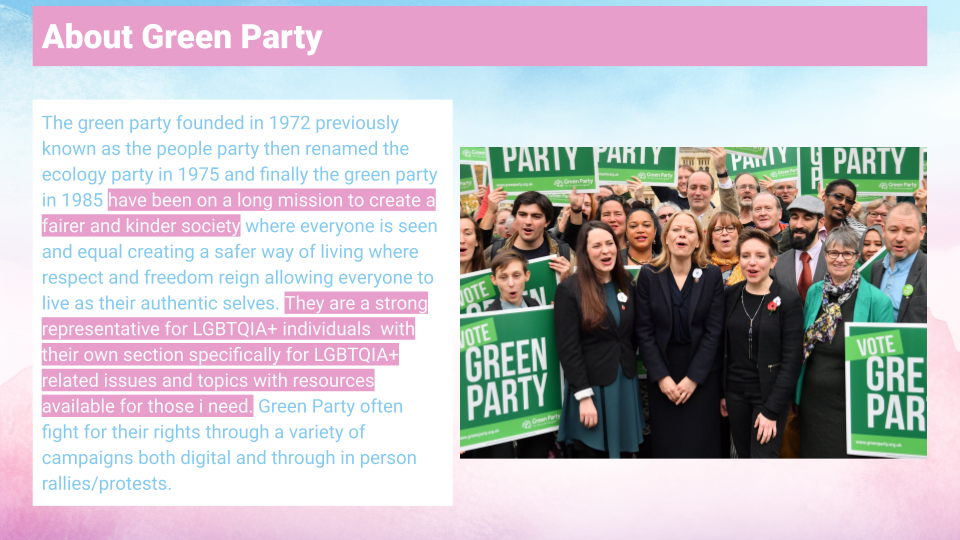
Project Overview
This project focuses on raising awareness of the abuse faced by trans people in the UK. I developed a campaign that uses bold statistics, empathetic messaging, and a stripped‑back visual system inspired by Green Party. The aim was to create a campaign that feels honest, accessible, and grounded in real experiences while remaining suitable for both print and digital platforms like Facebook.
Research & Insights
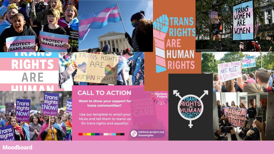
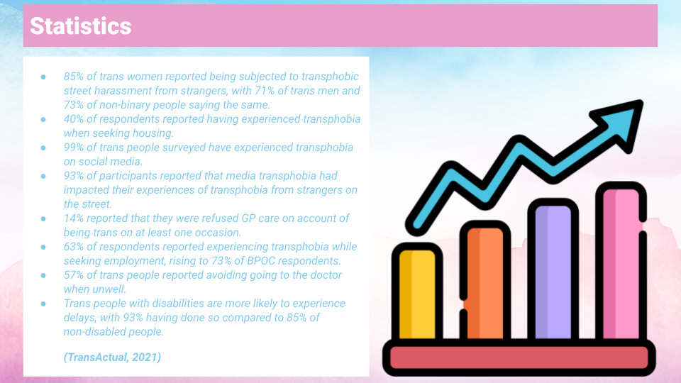
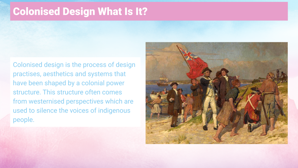
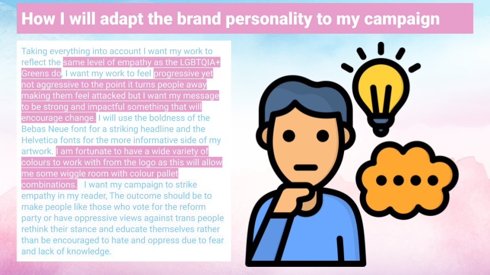
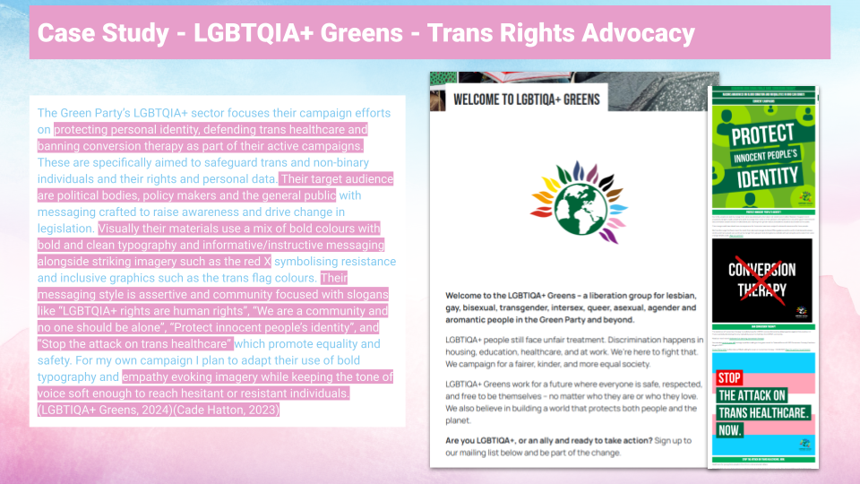
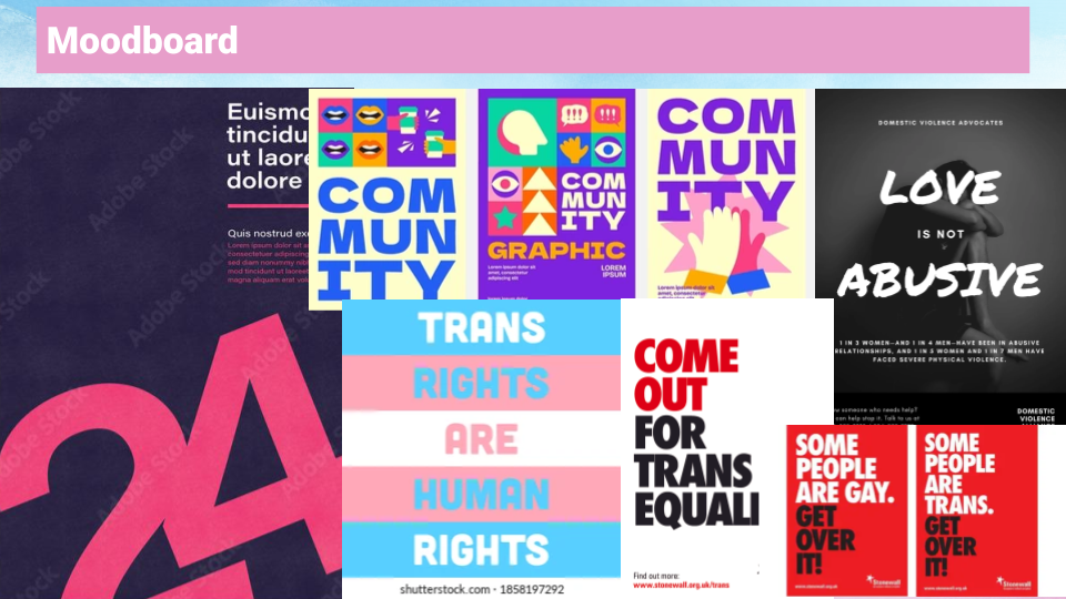
My research began with statistics on transphobia in the UK, which shaped the urgency and tone of the campaign. I explored political messaging styles, colonised design principles, and Green Party brand guidelines to understand how typography‑led communication can deliver powerful messages without relying on imagery. Moodboards and brainstorming sessions helped me refine the emotional tone and visual structure.
Concept Development
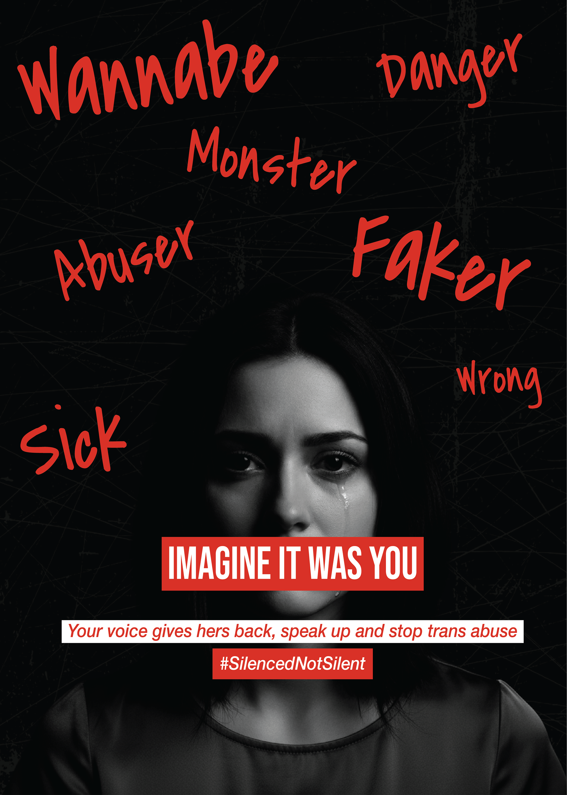
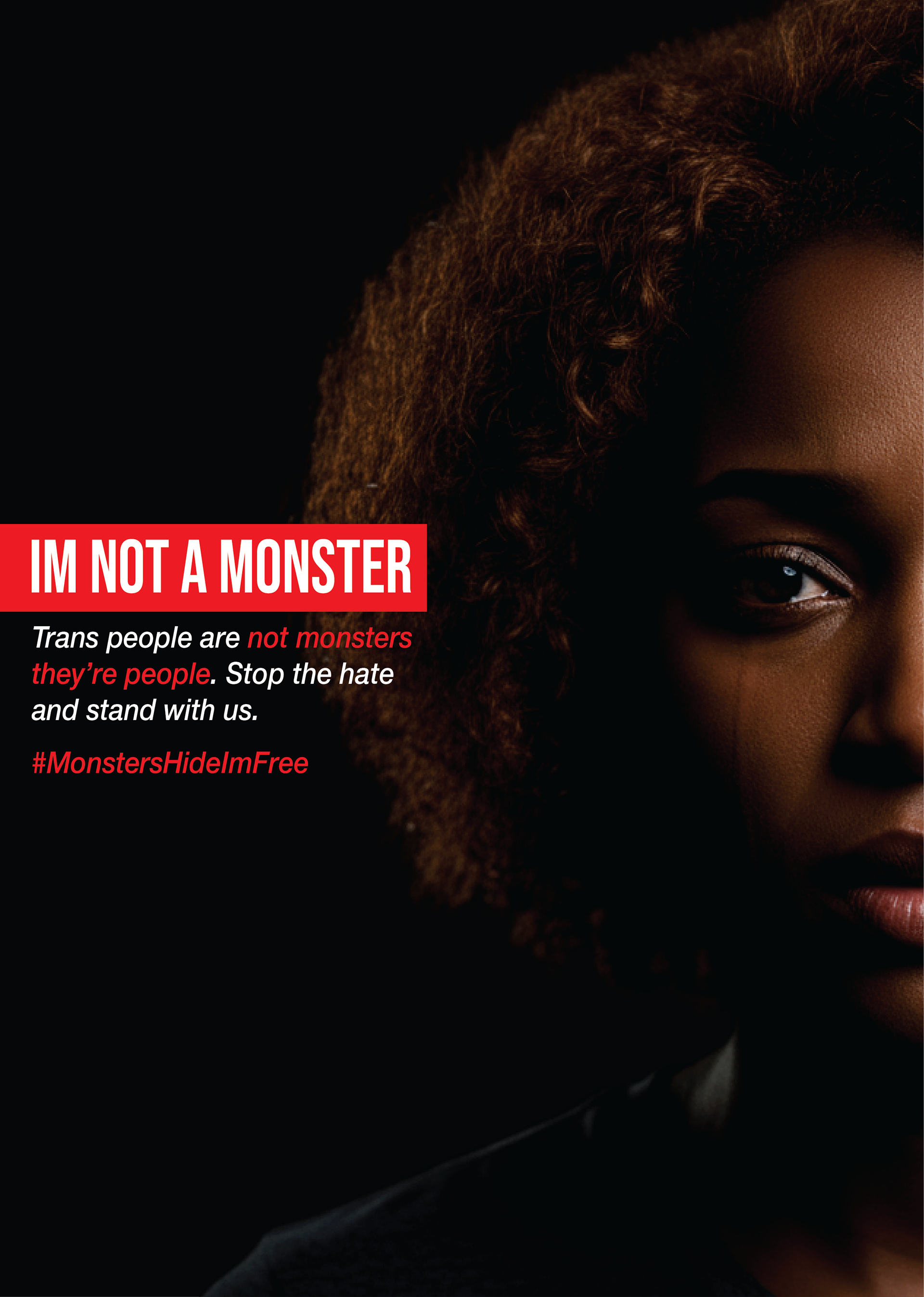
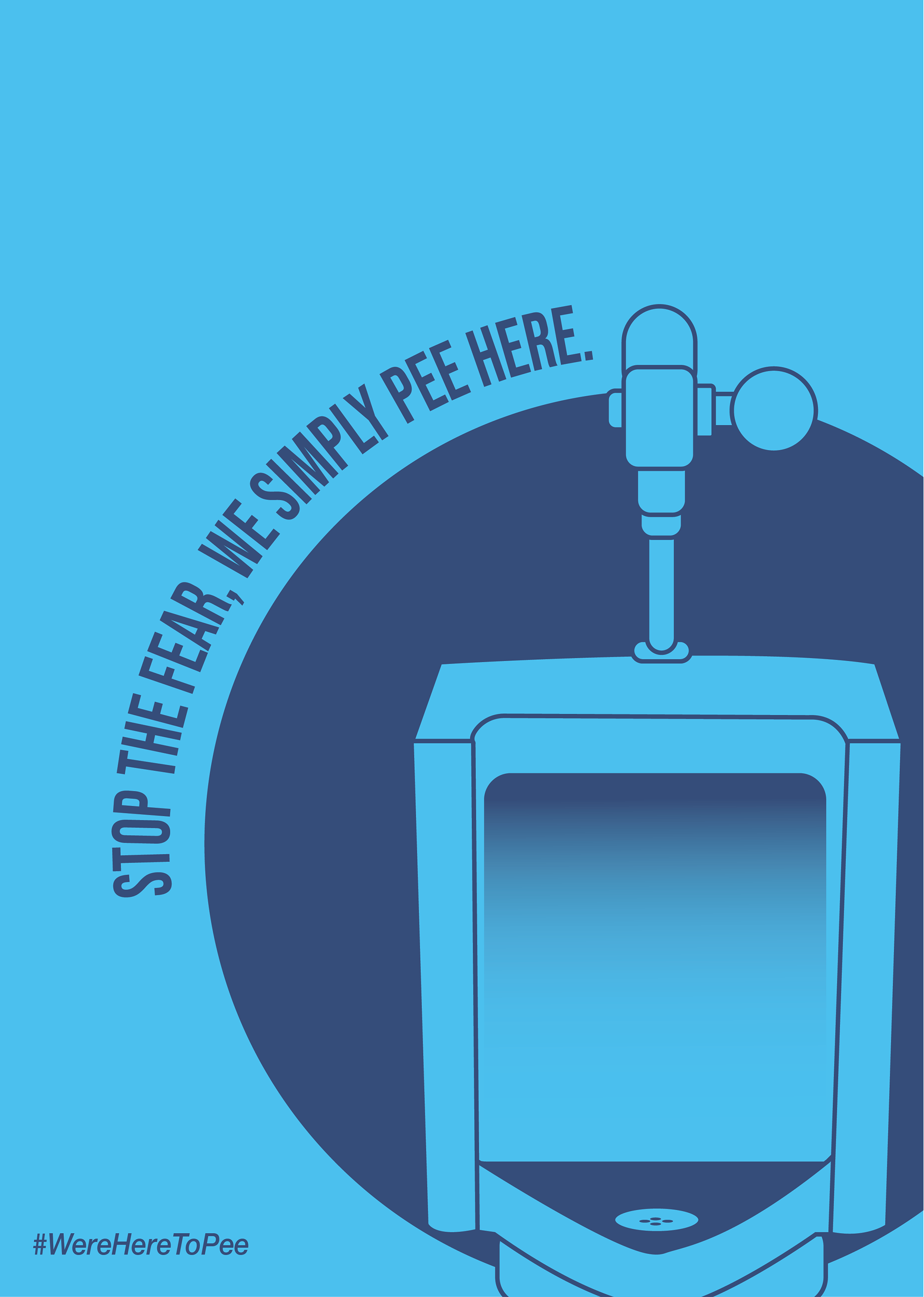
My initial concept explored how trans people are externally labelled as “monsters,” aiming to challenge that harmful narrative. However, I realised the message could be misinterpreted if not executed perfectly, especially by traditional audiences. This led me to pivot toward a fact‑driven approach that uses statistics to build empathy and credibility. Sketching and iteration helped me visualise the final direction and refine the tone.
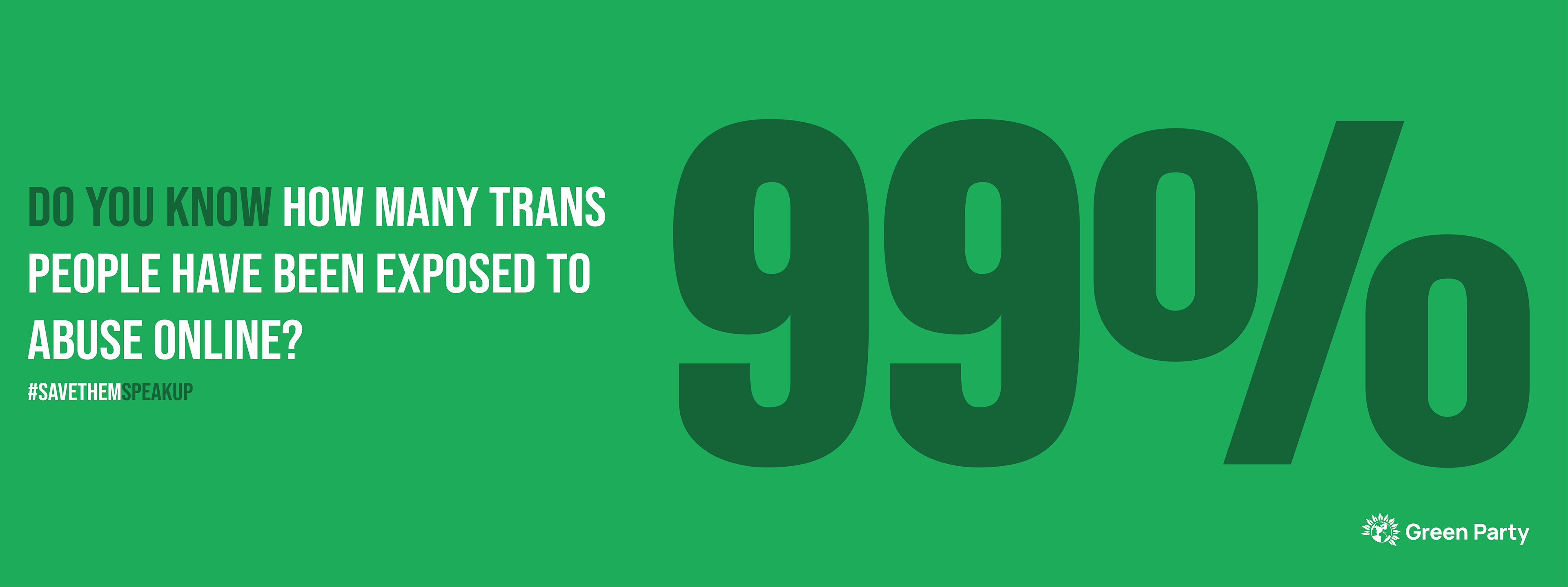
Visual Identity
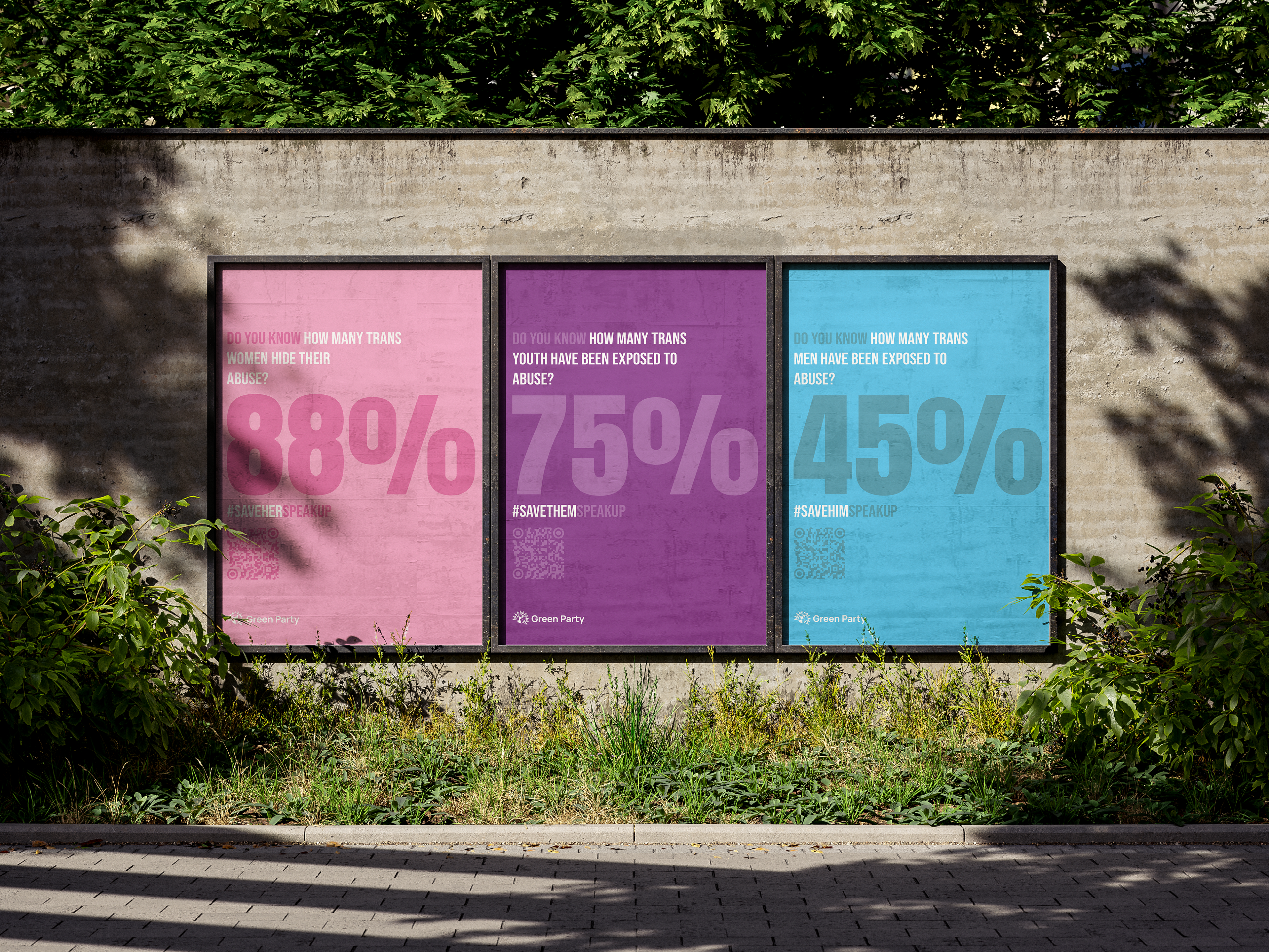
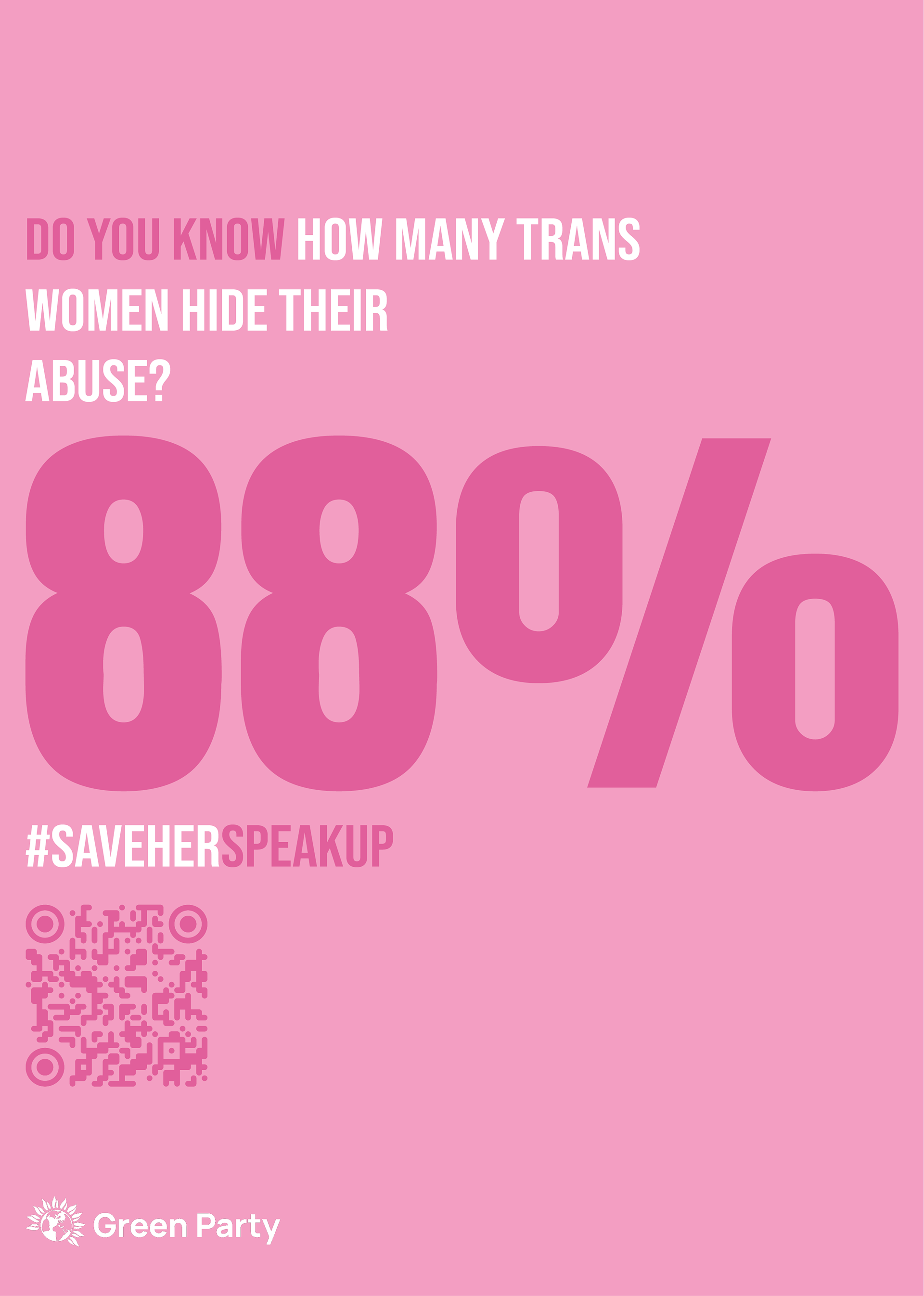
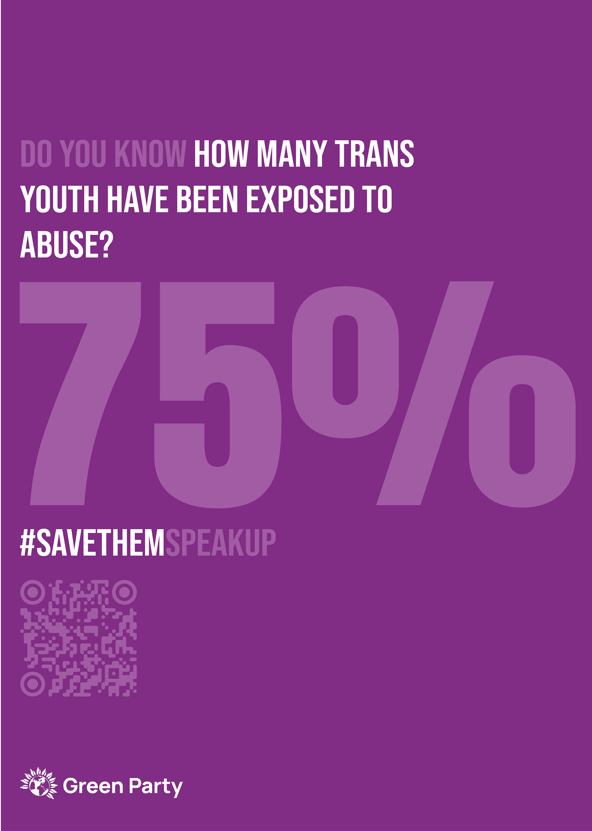
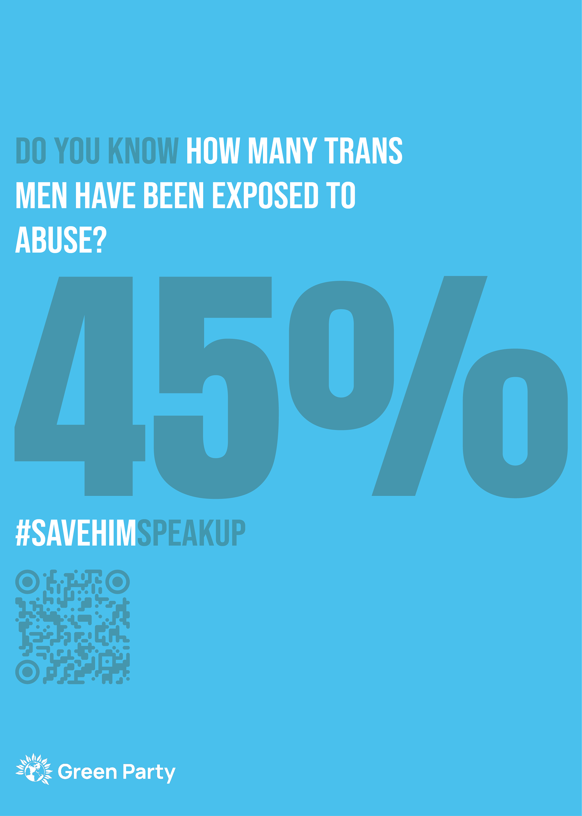
The final visual system uses bold typography, colour‑coded posters, and a clean layout to ensure clarity and accessibility. The stripped‑back style reflects Green Party communication, where typography carries the emotional weight of the message. Each poster uses a single statistic to keep the message focused and easy to digest, especially for older audiences who prefer straightforward information.
Final Posters
The print posters form the core of the campaign. Each one highlights a different statistic about the abuse faced by trans people, paired with a clear call to action. The consistent layout and colour system create a strong visual identity that is easy to recognise across different contexts.
Digital Adaptation (Facebook)
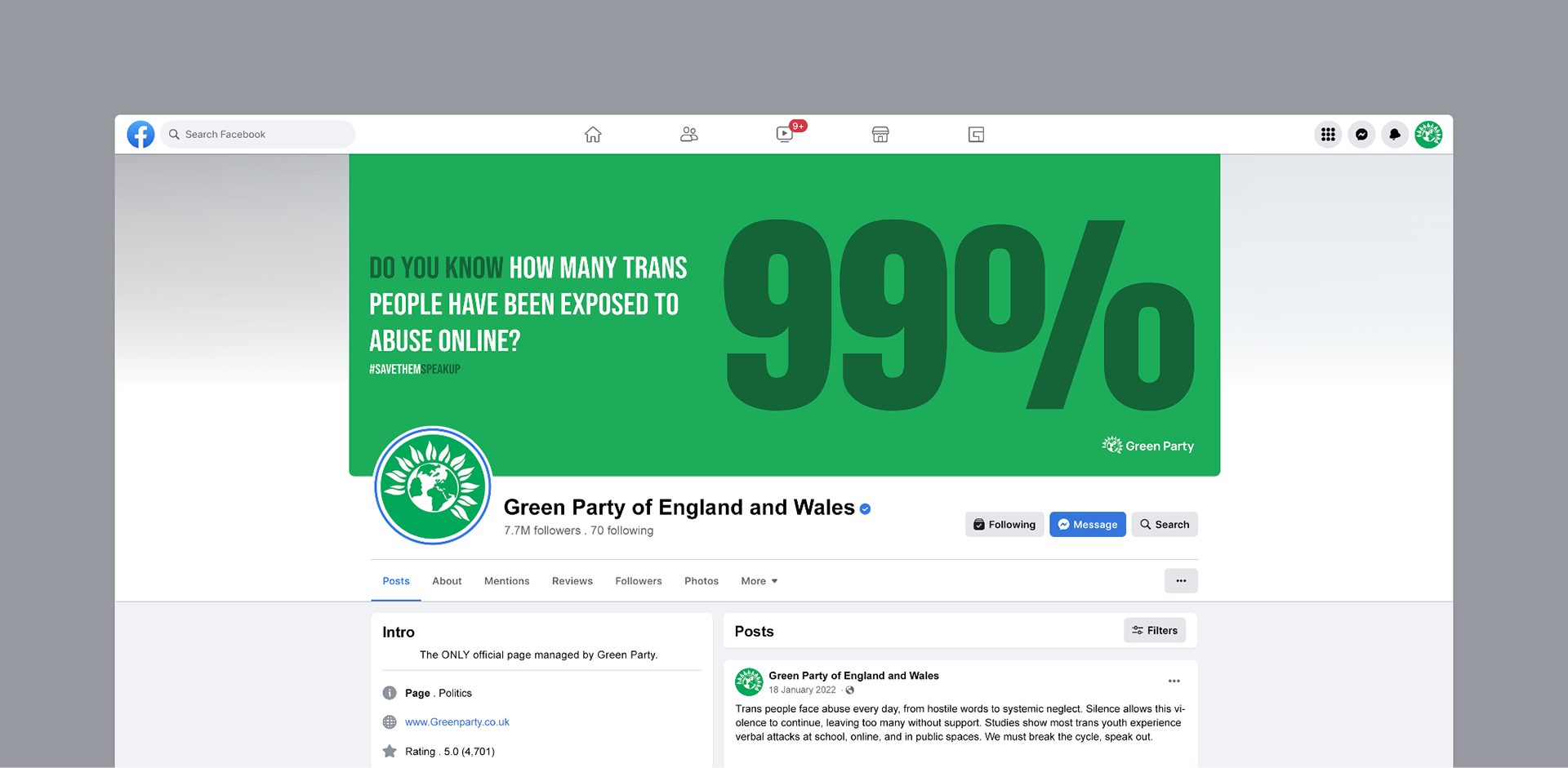
The campaign was adapted for Facebook to reach my personas, who use the platform for news and media. I removed the QR code for the online version since Facebook already supports direct linking and engagement. The digital posters maintain the same visual identity as the print versions, ensuring recognition across formats. Mock-up helped me test readability, emotional impact, and how the message sits within a real feed.
Project Reflection
This project strengthened my ability to communicate sensitive, real‑world issues through clear, accessible design. Developing the campaign taught me how to balance emotional impact with factual accuracy, using bold statistics and stripped‑back typography to create a message that feels honest and urgent. I refined my skills in research‑driven design, audience‑focused messaging, and adapting work across print and digital formats. Translating the posters into Facebook mockups improved my understanding of platform‑specific layout and how design functions within a live social environment. All assets were created using Adobe Illustrator, with Photoshop used to prepare mock-ups.
Skills
- research‑driven design
- typographic communication
- campaign messaging
- print‑to‑digital adaptation
- Adobe Illustrator + Photoshop workflow